Part 2 Project 4 Exercise 4 Monochrome

Monochrome.

I wanted to be sure I understood the criteria for a monochrome, so I searched the Bridgeman Library  under “Monochrome Still Life” and studied the results. I wondered how strictly the idea of a single colour had to be applied, and whether white and black were excluded as colours.

It seems that there is some lee-way, and some of the examples included browns, greys, yellow ochres and that the key is the subtly of shade differences.  See Gillian Carnegie;

http://www.bridgemaneducation.com/ImageView.aspx?result=0&balid=397419

and Kenneth Newton:

http://www.bridgemaneducation.com/ImageView.aspx?result=23&balid=201267

In some the backgrounds were a single colour starkly applied and the composition was in white and black and browns and greys, as in this example by E. b Watts:

http://www.bridgemaneducation.com/ImageView.aspx?result=46&balid=77357

I was not surprised to see several by Morandi, in muted greys and beiges.

http://www.bridgemaneducation.com/ImageView.aspx?result=17&balid=407442.

The Tate definition of a monochrome work is tight. It states that it is a work with only one colour, or shades of one colour. It gives a historical account of the approach, citing the fact that for centuries artists diluted black or brown inks to produce drawing in one colour. The French then used grey oil paints to make works which became known as grisaille. This exploited the play of light and dark to define form, a principal known as chiaroscuro.

More recent examples include this work by Toulouse Lautrec:

http://www.bridgemaneducation.com/ImageView.aspx?result=16&balid=49635

and this by Childe Hassam:

http://www.bridgemaneducation.com/ImageView.aspx?result=7&balid=984943

In the twentieth century, abstract artists experimented with the concept. Artists who are notable for their work in this style being Kasimir Malevich, Ben Nicholson and Yves Klein. Yves Klein was famous for his series of blue monochromes.

With all this in mind, I decided to try two different compositions, one in yellows, which would probably stick loosely to the definition of monochrome, and one in beiges, which I hope will yeild a more purist result.

Four hours later, with the first effort:

The photos are not great. I did the drawing a day before I took the photos and the light was very different, so the shadows in the photo are much stronger and the colours paler.

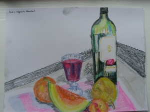
Monochrome Still life in yellow. Part 2 Prject 4 Exercise 4


Monochrome still life in yellows. Part 2 Project 4. Exercise 4.

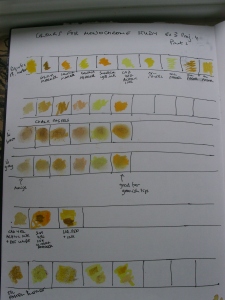
I started by experimenting with different media, trying to establish which were best for the tonal range and surface textures.
SAMSUNG DIGITAL CAMERA
Chart of colours and media.

This showed me that fibre tips where not useful and that the best medium for blending was the soft pastels. I therefore chose to use acrlic paper with tooth as this was sufficiently robust to take the wet inks and the tooth held the pastels well.

I used an acrylic ink base for the drawing, this time managing to get the dark tones in first, but I did find it hard to mix and dilute the inks to differentiate between the tones and to represent the range.

I highlighted and further differentiated with soft pastels.

Overall, as a first attempt as a monochrome ever, I am quite pleased. I stood above the composition so as to see the tortilla chips in the bowl. The sweet corn was very pale and I have struggled to represent it , both in terms of its texture and the sheen on the nibs. I think the difference in texture between the shiny glass bottle and the chips is a fair result, but I have not really shown the texture of the glazed bowl, and am not sure how I could do this.

I didn’t see the slant to the right of the bottle. It wasn’t clear to me against the tiled wall, so the perspective is not accurate.

The tiles were really helpful in positioning the objects and getting their size accurate. This is something I still find difficult and frustrating.

Second Monochrome.

I wanted to try again, with a diffent colour palette and using different media.

The composition is inspired by a painting exhibited in the Summer exhibition at the Royal Academy.

Adrienne Blake 2015 Egg Box. Oil and charcoal.

Colour test chart:

SAMSUNG DIGITAL CAMERA

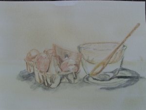
2nd Monochrome drawing Part 2 Project 4 Exercise 4

I used a watercolour wash and then drew with watercolour pencils, adding a few white highlights with an acrylic fibre tip pen.

I am pleased with the subtle colours and the airiness of the drawing. This was what I like about the Adrienne Blake painting.

I enjoyed using the watercolour pencils and I think they were a good choice for the subject and effect I wanted. The watercolour paper I had available is not A3, but I needed the surface and the thickness of the paper. I tried a watercolour wash on Fabriano paper, but it “buckled” , so I had to discard it.

 

Part 2.Project 4. Exercise 3 Experiment with mixed media

Experiment with mixed media.

The first word in the title of this exercise “Experiment” gave me freedom to play about.

I was, until starting this course, rather dismissive of collage, thinking of it as “cutting and sticking” like in primary school. But I’ve shifted my view significantly, having looked at the work of artists who use it successfully, for example Day Bowman. My impression is that it works best with a more abstract approach, and that is not the brief here, so I was unsure how to start, but knew I wanted to try.

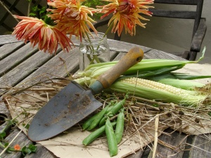
As usual, I took some time to decide on my subject, and had to modify my initial idea as I couldn’t easily find any sunflowers! I so love them as a subject, along with thousands of would-be Van goghs, I know. i was surprised to see two works using sunflowers as their subject, in the Summer Academy this year. I opted for a maize cob, for its texture and dahlias, because they were there and have a similar shape to sunflowers, but are blowsier – quite impressionistic.

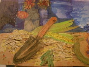
Dalhias at Dusk. Exercise 3 Project 4 Part 2.
Composition for Exercise 3 Project 4 Part 2.

I have used torn newspaper, brown paper bag, straw and dried grass, glue, Liquitex acrylic ink, brush, biro, oil pastels and salt crystals in my work. My surface was brwon cardboard, as I needed the robustness to carry the materials .Given all of these materilas I’m confused about it being a “drawing”, but I understand this was what was required. I really enjoyed the experiment, but it took me a long time.

SAMSUNG DIGITAL CAMERA
Dahlias at Dusk. Exercise 3 Project 4 Part 2

I chose the dark blue newspaper for a few reasons. It reminds me of Van Gogh’s Sunflower series where he always uses blue (the complementary of yellow) in his compositions. I was influenced by the example work in the Study Guide, and because there were several sheets of varying blue tones in the paper.

I wanted to create a rustic look with the straw, and have seen raised effects by sticking paper over objects, such as string, or creasing the collage paper, so I tried this, by using soem starw under the creased and torn brown paper bag. the colour of the brown paper blended well with the brown card which made life easier.

I started with a rough pencil sketch and then added the well-diluted acrylic ink, so it was like watercolour, except the lines dried quickly and were permanent, which I like. I tried to find the dark tones first and then add lighter.

I came unstuck (literally) with the maize, as I had an idea I wanted to capture the texture of the grains. I tried sticking rolled soggy balls of soaked egg-box cardboard, but it looked very “primary school” so I took them off, when they were partly dry and left the imprint. I was quite happy with the result.

The thing looked very washed-out at theis stage, with little coherence. I added oil pastel, using quite a lot of pressure. I used red biro to bring some dimensional quality to the dahlias.

The weaknesses are the peas in their pods which are barely recognisable and could be taken out, and the trailing cob leaf cover on the lower right of the composition. Also, the light was mostly from behind the composition and the shadows were weak, but on the right, yet the remaining light in the sky in the drawing, is coming from the same side. This is probably a fundamental mistake, but one which occured because I was using the collage paper, not the true background.

Overall, the drawing has an “impressionist” feel which I like and has very strong reference to Van Gogh, in the use of colour and the dark sky.

Part 2 Project 4. Exercise 2 Still life in tone using colour

Still life in tone using colour.

I did some preliminary sketches to get used to the materials and ideas.

Sketch for coloured tonal study. Pastels.
Sketch for coloured tonal study. Coloured pencils.
Sketch for coloured tonal study. Coloured pencils

This exercise was a difficult one, using colour “quickly” and trying not to make outlines of the objects.

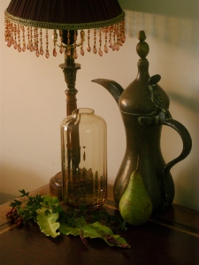
Still Life Arrangement 1. Exercise 2 Still life in tone using colour

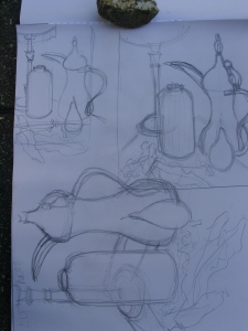
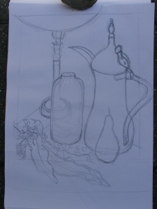
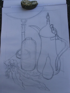
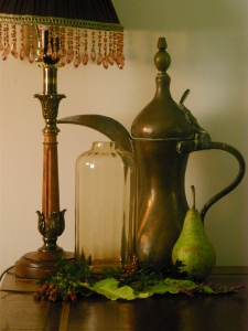
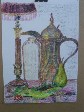
I took a long time to decide on my objects, and arranged them with a strong light on one side and sunlight coming from the same side. this created some interesting reflections, which I hoped to capture. I think the composition was rather ambitious, especially including the glass vase with fluting. I liked the colours, the dull brass of the Saudi tea pot, and the brownish-apricot of the fluted vase, but again, I was not confident that I would be able to match them using the materials I have available.

I made several warm-up sketches. I find it very difficult to sketch small, so they were all quite large.

Sketches Exercise 2
Sketches Exercise 2
Sketch Exercise 2
Sketch Exercise 2
sKETCH eXERCISE 2
Sketch Exercise 2
Sketch Exercise 2
Sketch Exercise 2

I was standing and looking down onto the composition, and the tea pot was at a difficult angle. I struggled with the shapes and positioning.

Then I moved position, and sat with the arrangement almost on my eyeline and the teapot side-on. This created negative spaces which made the drawing of the shapes much easier.

Still life arrangement 2. Exercise 2 Still life in tone using colour.
Sketch Exercise 2
Sketch Exercise 2
Part 2 Project 4 Exercise 2 Still life in tone using colour. Oil pastel on Fabriano paper
Part 2 Project 4 Exercise 2 Still life in tone using colour. Hard pastel on Fabriano paper.

This took about 45 minutes.

Part 2 Project 4 Exercise 2 Still life in tone using colour. Oil pastel on acrylic paper
Part 2 Project 4 Exercise 2 Still life in tone using colour. Hard pastel on acrylic paper.

This took at least an hour and a quarter.

Review of work in Exercise 1 and 2 Project 4

I have already commented on some of these points eg Point 1, What aspects of each drawing were successful and what did you have problems with.

There is more depth achieved in the second exercise than the first, I think because of the strong sunlight and the fact that I was looking down more on the arrangement in the first. I have made more effort with background in the second, including trying to give a sense of the shadow thrown on the wall behind the objects. It was difficult for me to get depth using coloured media, and I think that I shouldn’t have used black, especially the dark black line on the foot of the lamp.

I am not sure that I have successfully exploited the potential of blending (if there is potential with hard pastels). I used two different types of paper to see if it made a difference. I am happier with the results on the acrylic paper, but it took much longer to complete.

Part Two Project 4 Exercise 1 Still life using line

Still life using line

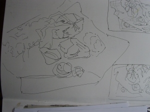
Compositional sketch for line study.


Part 2 Project 3 Exercise 3 Seaweed and Shells on a Dish-cloth

Part 2 Project 4 Exercise 1 Seaweed and Shells on a Dish-cloth. Dip pen and black ink.

The same objects are drawn againg using the broad dip pen and fibre tip pens. I used a sheet of coloured newspaper and collage with sand and acrylic pens. I wanted to experiment with some of the media that I have bought and haven’t been bold enough to use.

I like both compositions. The dishcloth holds the objects together in the first, and although it is a rather odd addition to the subject, it fits because it is rough and worn and the folds can be seen as the dips and curves one sees in the sand on the shore.

The colour of the paper in the second drawing holds the composition together, and the tears in the lower margin are wave-like and suggestive of the sea. Although this is a departure from the brief as it incorporates colour, it was interesting to me to experiment and I found the acrylic pens were much less harsh and stark when used on the coloured newspaper. This finding may help me in the next exercise.

Stones. Shells and Seaweed. Mixed media.