Assignment 2
After all the work and different projects and exercises it has been difficult to decide what to focus upon for this assignment.
However, I have become more aware of what I consider to be my relative strengths and weaknesses. I have also, through my research, learnt a great deal about other artists and their approaches to the areas of creativity explored in this section of the course.
The work of certain artists has held my attention: Sara Dudman, Sabine Moritz, Ivon Hitchens. Is there a common thread in the approach of these artists? Sara Dudman’s work “Flocking Together” captures the movement and collective life of a flock of sheep, the farmer and his dog. It is alive with movement and appears deceptively simple. There is also simplicity in the work of Sabine Moritz in “Lobeda” and in the interiors by Ivon Hitchens “The Red Curtain” and “Boy with an Interior”. I have become aware however, that I cannot replicate or create such economy of line and shape at this stage of my development, partly because the course asks for accuracy and “tightness” and partly because I am learning that it is very difficult to acheive without a solid foundation.


As far as the projects and exercises go, I see a progression in my ability, in terms of some greater familiarity with some of the media, a somewhat better understanding of the difference between line and tone, and how to acheive depth using these different techniques. I am aware, however, that the depiction of depth using line is not my strength, as I do not have confidence in drawing lines, and have not developed a technique which conveys the complexity of subjects without “over-drawing”.
I have improved in my ability to convey perspective more accurately, but it takes me a long time and many attempts to do so. This was particularly apparent in the work on interiors, but I believe that the exercises and my reading and practice have helped. I think I am better at drawing elipses and simple cubic shapes, and have tried to reduce more complex shapes to simple basic shapes (for example chairs and cubes).
I have experimented with different media, learning some basic skills with soft and hard pastels, and oil pastels, wax resist, watercolour washes, and the use of ink and pens. I have deliberately worked in pencil when I am more comfortable with charcoal, in order to try to extend my skills. I have also used Conte crayons, watercolour and coloured pencils and wax crayons. I know that I have masses more to learn with all these media, but given my initial starting point, I have made significant progress.
The following considerations have influenced me in my choice of subject for the Assignment.
Practicalities.
Interior studies became limited whilst my flat was being re-decorated.
The light has been poor in the last two weeks.
Aesthetics
I have an inkling that the debate about ‘what is beauty?’ is spralling and unwieldy. I understand that art does not have to be about capturing beauty, but I am challenged by finding an area of interest which does not incorporate some effort to do so.
I am not attracted to works that appear to make no appeal to the emotions of the viewer, although I am aware that what stirs an emotional response in one person may hold no resonance for another. Nor am I attracted by gushing sentimentality. I am beginning to think that the artist has to acheive a very delicate balance between involvement with the subject and detachment from it, in order to allow the viewer to form a personal response, rather than being flooded with the projections of the artist.
At my early stage, most of the effort is in developing the technical skills necessary to portray anything. I have approached each of the exercises in this fashion, without having much spare energy to devote to other considerations. But when it came to the decision about choice of subject for the assignment I had to crapple with it, as the field was thrown open more widely.
Consideration of Assessment Criteria
Demonstration of technical and visual skills.
I have certainly progressed in these aspects, and believe that my work across Part 2 demonstrates this. I have become aware of the concept of negative space and how attention to this can aid in the accuarcy of a drawing. The range of materials I have used has certainly increased, although I have a lot to learn about the media. I have learnt about design and composition through the research I have undertaken, but am constrained in its application by the limit to my technical skills.
Quality of outcome.
Some of these are more wooly concepts which I find difficult to quantify. Content is fairly strongly dictated by the course book. Presentation of work in a coherent manner is something I probably need to improve upon, but is better than it was. I am still a novice in blogging and in the keeping of a sketchbook, but I think that as I have moved through Part 2 I am becoming more proficient. I do not have the time to decorate my sketchbooks or attempt to make them into works of art in themselves. If I am asked to provide more writing on conceptualisation, and communication of ideas, I will struggle to be original. Thus far my energy and effort is largely taken up by the learning of techniques, and whilst I enjoy looking at and thinking about the work of others, it is difficult for me to apply the same analysis to my inexpert work..
Demonstration of creativity.
I am in very early stages of all these aspects of the process, and am not sure that there is much to see by way of progress. I think I have been most imaginative whilst drawing the sheep and pigs, even though the results are figurative. I wanted to show something of the relational aspects inherent in the animals, and looked for evidence of this whilst sketching and photographing them. As far a a personal voice goes, I know what I like it the work of others, but cannot say that I have any firm feeling for a voice of my own. I know what appeals to me and what I shy away from, but this is generally because I find some aspects easier than others, and I am trying not to allow this to dictate what I do.
Context reflection.
I have certainly engaged with research, although at this stage I have mostly been opening my eyes and mind and trying to understand the breadth and depth of things, which is a massive challenge. Critical thinking must follow from a better understanding of the subject, and I am reluctatnt to jump in with too many opinions before I have a better foundation. It may be that I will need to take more risks with this. Any critique of my own efforts has primarily concentrated on the accuracy of portrayal and my attempts to master the media, although I have worked at producing more interesting compositions, and can sometimes see what makes for a better result.
Finished Assignment “Autum Bench”.
This subject is interesting to me on several levels. I like the connection to the natural world and the underlying idea of growth and yield, even ‘the fruits of one’s labours’. In a way the subject is a metaphor for the work I have done in Part 2.
I have consistently found the depiction of natural objects and images easier and more enjoyable than of man-made objects, and in this assignment I have played to my strengths in the choice of a natural still life.
The present season lends itself to the subjects also, and this is probably my favorite season, because of the warm tones I see around me everywhere. I have enjoyed choosing a warm colour palette and mixing the colours. A few years ago, I travelled in Franken, a region of Germany, in October , where there were carts piled high with pumkins along the roads. I found it romantic. I am keen to live more sustainably, and sourced the squash, pumpkin and beetroots from a local producer , and the quince and medlar came from trees in the garden.
I have attempted drawings and acrylic painting of beetroots and squashes before, so was building upon past experiences, but I am quite unfamiliar with watercolour and have felt quite nervous of using it because it requires a different approach to acrylics. I decided to learn the techinque of wax resist, so bought some oil-based pastels and watched some online videos to get me acquainted to the technique. I also referred to “Warecolours Made Easy A complete beginners Guide”, by Miranda Fellows.
I am very fond of this painting by Renoir, which I came across in my research of still life. Not so much because of the composition, but because of the colours and the endearing echoes of shape in the miniture heads of children that he has painted in the right upper corner.

The composition in the photograph below is similar to the one I used in as much as the objects are placed linearly and overspill the edges of the picture plane.

Photographs of my compositional tests.


I wanted the objects to be drawn in an outside envirnment. if I had a garden shed, this would have been ideal, but the garden bench was good enough, and I used natural light. this was a problem, as there was only one day upon which there was a short spell of sunshine, and the rest of the outside work was done in grey, damp conditions, and finally from a photgraph indoors.
I tried many different arrangements of the fruits and vegetables I wanted to use, which I photographed. The final choice was made after consideration of the colours. The pumkin, with a slice removed, revealed a rich orange which is echoed in the stripes of the squash. The soft yellow tone of the squash is picked up in the tones of the quince, which also spreads into a more acid yellow. The movement of the purple beetroot, through the middle , with its tracing of the purple stems leading to the greens and the edge of the page, all enhance the composition.
Sketches of compositions


I found that to capture the subtle changes in colour and tone of the maple leaf, it was more effective to lay down the basic shape and colours in oil pastel and then add a watercolour wash in different greens. In contrast, the smoother, glossier tones and colours of the quince were better depicted using watercolour first with the light addition of oil pastel to small areas. The speckled appearance of the medlar was captured with an oil pastel base and overlay of brown watercolour.

I used watercolour paper, previously stretched, and made a light sketch outlining the shapes with the appropriate watercolour pencil. Then I mixed a warm tonal colour palette using Prussian Blue, Cadmium Red, Cadmium Yellow, Burnt Umber and Chinese White with the addition of Payne’s Grey. When it came to making the purple for the beetroot, I used Cereulean Blue as it gave a brighter tone. I was aware that using the Chinese White would loose me the translucency of the watercolour, so I avioded it until the end of the painting.
The contrast between line and tone has been difficult for me throughout this course so far. However, I think that I have managed this better in this piece, by avoiding drawing outlines as far as possible, and by allowing the watercolour to form edges. This is best seen in the medlar friut, as shown in the close-up below.

The beetroot stalks also show differences between line and tone, by capitalising on the properties of the different media, and leaving white paper spaces.

Again, here the contrast between the flesh of the pumpkin and the pith and seeds is acheived in the same way with the watercolour, but with the addition of oil pastel and the wax resist technique.
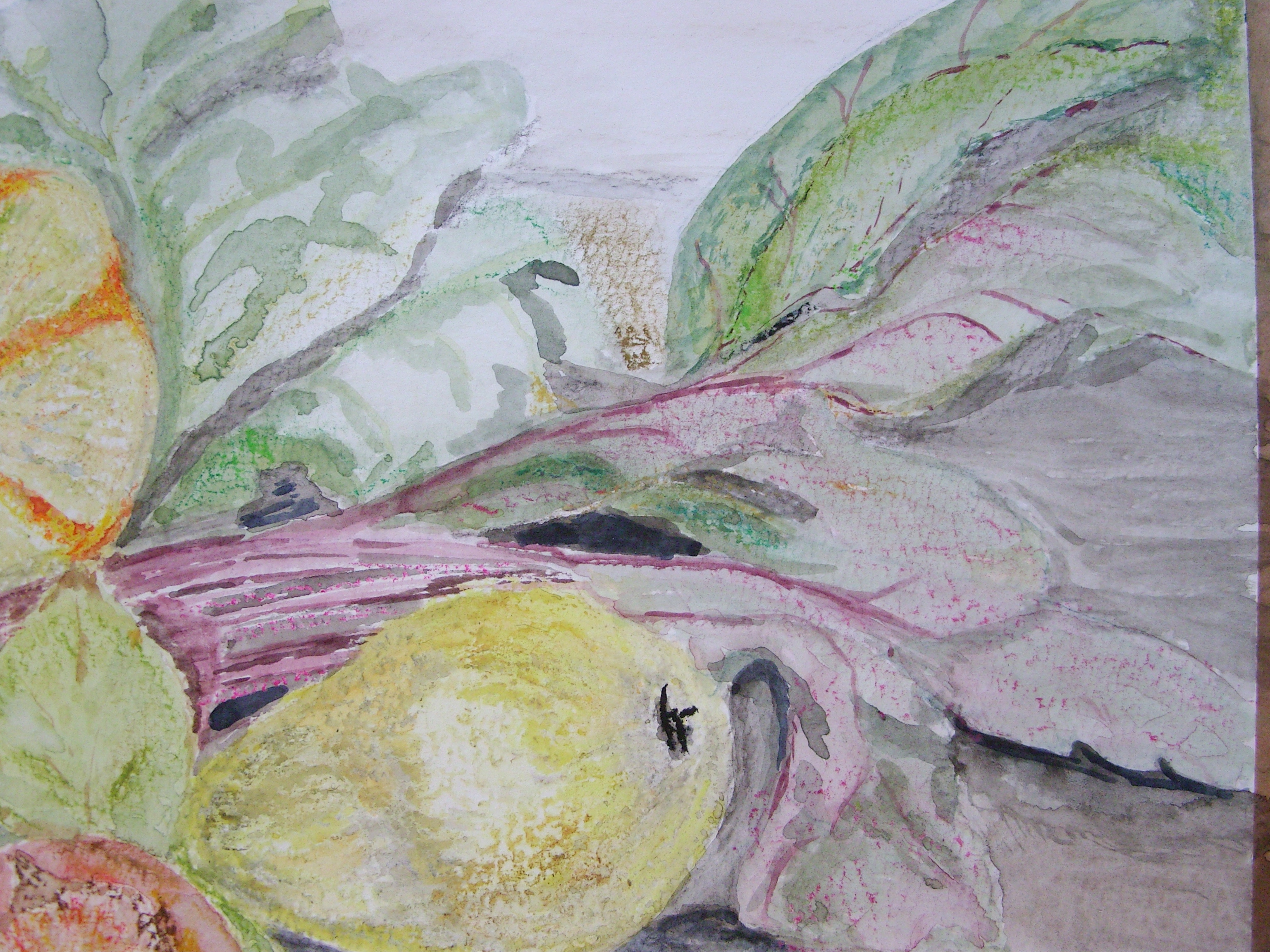
The quince was difficult to portray, as it has a uniformity of colour with only very subtle tonal shades which were hard to replicate. I used grey oil pastel, partly to give depth, but also to try to show the soft down which was still present on the fruit in patches. The form and texture of the beetroot leaves are well shown by using wet on wet watercolour, and in the case of the purplish leaves, wax resist with a magenta oil pastel.
Overall, I am pleased with my work. I am aware that the vibrancy of colours and contrats in colours is not replicated with the watercolours as I have used them, but I think the fluidity in the composition is enhanced by the flow in the media. My attempts with other coloured media earlier in the course were quite disappointing in respect of my ability to build up the colours so as not to have a lot of the paper showing through, and I wanted to avoid the same problem here.
My main criticism is of the context. The background is not shown in any detail, and whilst this gives precedence to the subjects of the composition, it does not really contextualise the arrangement. I find some consolation if I consider the simplicity of the work of Morandi, with its horizontal lines and simple block colours for background and foreground, but I have to concede that there is very little parallel between the styles or subjects. Another work which I like is the painting by Olwyn Bowey RA Sunflowers, which I saw at the Summer Exhibition this year.

This painting is of the interior of a garden shed, or similar. The gourds are incidental to the main subject of the pot of sunflowers, and in fact provide the context by implying the season. This made me wish for a garden shed, although I would have been truly challenged by the detail, and the plants and vegetables would have been long dead before I had finished.
References
Fellows, M. (1995) Watercolours Made Easy: A Complete Beginner’s Guide. London; Parragon Book Service.
